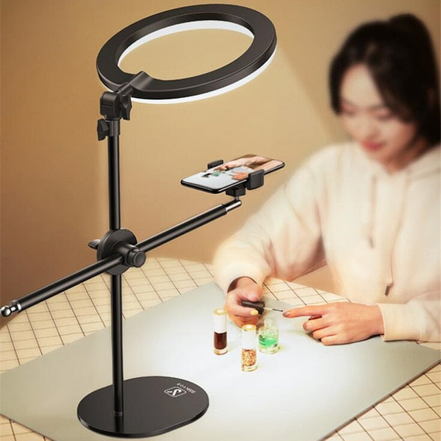
LED Tabletop Ring Flash Tripods Monopod Mobile Phone Holder LightLED Tabletop Ring Flash Tripods Monopod Mobile Phone Holder Light
£ 90.00 GBP
Tax included.

Product title: LED Tabletop Ring Flash Tripods Monopod Mobile Phone Holder Light.

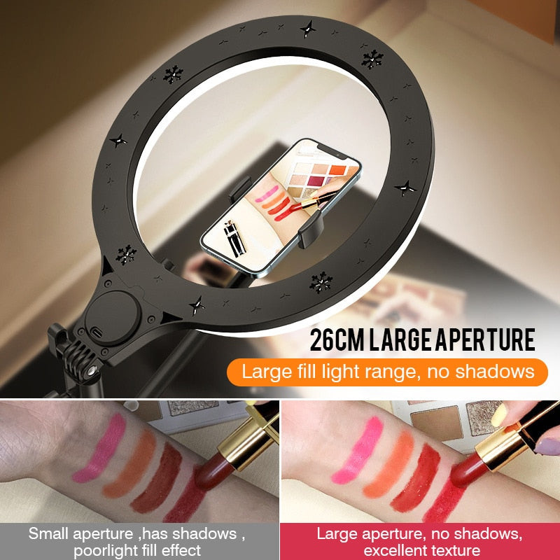
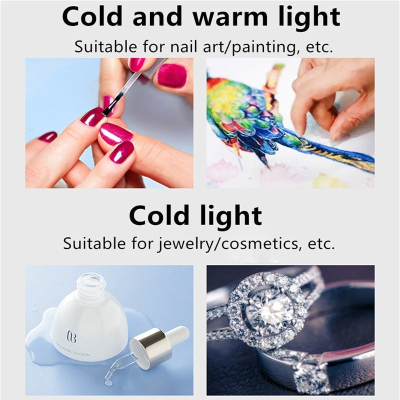
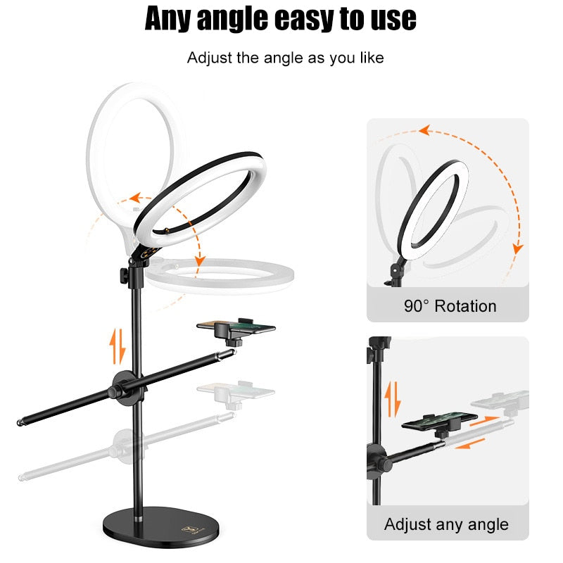
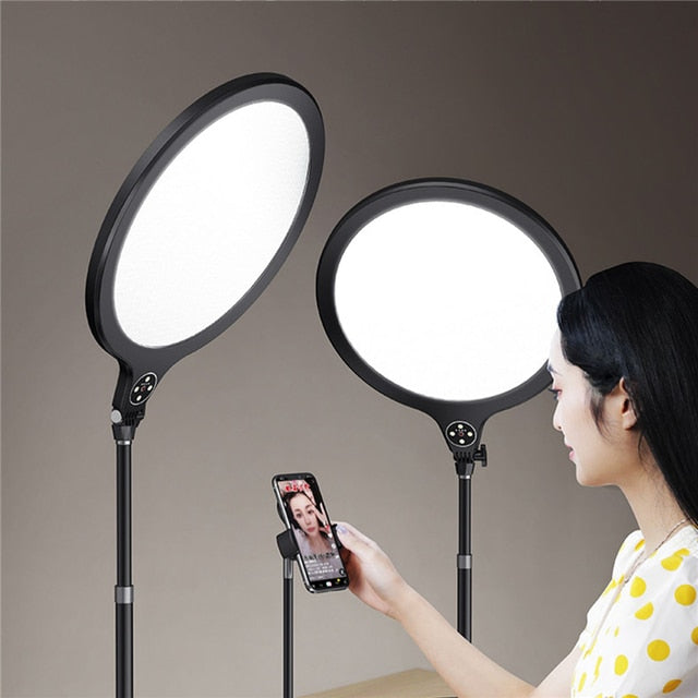
Features: *26cm /10inch large aperture: large fill light range, sufficient brightness, no shadows, stability, imported diffuser, uniform and soft light. * 3 kinds of light effects: warm light, cold and warm light, cold light, to meet different needs. * Separate mobile phone and fill light: fill light can be adjusted 360°+180°, mobile phone holder can be adjusted 360°, mobile phone pole can be adjusted in height, or 360° to meet various needs. * High-quality material: The whole body is made of carbon steel, and the base is strengthened to make the shooting more stable. * Non-slip foam: about 3cm thick non-slip foam to protect the desktop. * Mobile phone special clip: suitable for mobile phones with a width of 6.5-10cm (screen ≤6inch).

This LED Tabletop Ring Flash Tripods Monopod Mobile Phone Holder Light is a unique product that offers a wide range of features and benefits. It has a large fill light range, three different light effects, adjustable mobile phone and fill light, and a high-quality material construction. The non-slip foam and mobile phone special clip make it perfect for overhead shots for nail art.

Frequently Asked Questions

Use rows to highlight unique features,
sizing information,
or other sales information.

Use rows to highlight unique features,
sizing information,
or other sales information.

Use rows to highlight unique features,
sizing information,
or other sales information.

/* Centering the menu */ .main-navigation ul { display: flex; justify-content: center; } /* Enabling hover effects for menu items */ .main-navigation ul li a:hover { /* Your hover styles here */ color: #ff0000; /* Example: Change text color on hover */ } /* Positioning the logo at the top */ .site-logo { display: block; margin: 0 auto; text-align: center; }
.site-header { display: flex; justify-content: space-between; align-items: center; padding: 10px 20px; } .header-logo { flex: 1; text-align: center; } .main-navigation ul { list-style-type: none; padding: 0; display: flex; justify-content: center; flex: 2; } .main-navigation li { margin: 0 15px; } .main-navigation a { text-decoration: none; color: #333; transition: color 0.3s ease; } .main-navigation a:hover { color: #007bff; } .search-bar { flex: 1; text-align: right; } } } function sendEmail(email, message) { console.log(`Sending email to ${email}: ${message}`); // Add actual email API call here } autoMarket(); }); /* Add spacing between logo, search bar, and menu */ .header--logo { display: flex; justify-content: center; align-items: center; margin-bottom: 10px; /* Creates gap between logo and search bar */ } /* Ensure Search Bar is Responsive */ .header--ai-search { display: flex; justify-content: center; align-items: center; width: 100%; max-width: 600px; /* Adjust width */ margin: 15px auto; } /* Ensure Input Container Stretches */ #ai-search-container { display: flex; align-items: center; width: 100%; max-width: 550px; height: 40px; /* Adjust height */ border: 1.5px solid #0070f3; border-radius: 20px; background: #f9f9f9; box-shadow: 0 1px 5px rgba(0, 0, 0, 0.1); padding: 5px; } /* Fix AI Search Button */ #ai-search-button { background: #0070f3; color: white; padding: 8px 15px; border: none; cursor: pointer; border-radius: 0 20px 20px 0; font-weight: bold; } #ai-search-button:hover { background: #005bb5; } /* Ensures navigation menu is centered */ .header--nav { display: flex; justify-content: center; align-items: center; margin-top: 10px; /* Creates gap between search bar and menu */ } .header-navigation ul { display: flex; gap: 10px; /* Reduce menu item spacing */ justify-content: center; /* Center the menu */ } .header-navigation li { padding: 5px 10px; /* Adjust padding inside menu items */ } .header--nav a { text-decoration: none; font-size: 16px; font-weight: bold; color: #333; padding: 8px 10px; /* Reduces padding */ } .header--nav a:hover { color: #0070f3; } /* Ensure AI search bar stretches with its container */ #ai-search-container { display: flex; width: 100%; max-width: 600px; /* Adjust as needed */ height: 45px; border: 1.5px solid #0070f3; border-radius: 20px; background: #fff; padding: 5px; box-shadow: 0 1px 5px rgba(0, 0, 0, 0.1); } #ai-search-input { flex-grow: 1; border: none; padding: 10px; font-size: 16px; outline: none; background: transparent; width: 100%; color: black; } #ai-search-button { background: #0070f3; color: white; padding: 10px 15px; border: none; cursor: pointer; border-radius: 0 20px 20px 0; font-weight: bold; } #ai-search-button:hover { background: #005bb5; } /* Reduce AI Search Bar Width & Center */ #ai-search-container { display: flex; align-items: center; /* Align input with button */ width: 100%; max-width: 600px; /* Adjust as needed */ height: 45px; border: 1.5px solid #0070f3; border-radius: 20px; background: #fff; padding: 5px; box-shadow: 0 1px 5px rgba(0, 0, 0, 0.1); margin: 0 auto; /* Centers it */ } #ai-search-input { flex-grow: 1; border: none; padding: 10px; font-size: 16px; outline: none; background: transparent; width: calc(100% - 50px); /* Ensure input stretches */ color: black; } /* Reduce Menu Gaps */ .menu-list { display: flex; justify-content: center; /* Center menu */ gap: 8px; /* Reduce space between items */ padding: 0; margin: 0; /* Ensure no extra spacing */ } .menu-list li { list-style: none; } .menu-list li a { text-decoration: none; font-size: 16px; padding: 5px 10px; /* Reduce padding */ display: inline-block; }